Gutenberg Blocks
There are quite a number of blocks available within the Gutenberg editor, and a suite of custom blocks have also been installed with your theme. Here are some of the more important ones.
Important Blocks
-
Section — This is the basis of all pages. Think of this block as a "group". It allows you to set the background colour of the section, as well as fine-tune padding and margins between this and the next block (which could be another
Sectionblock). If the following options don't show up for you, make sure you select the Section block! You can do so by using the toolbar on the top of the editor.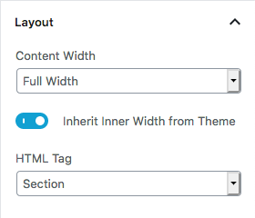
If you want the block to be full width (edge of browser screen to edge of browser screen), select
Full Widthfor Content Width. SelectInherit Inner Width from Themeto maintain consistency with the other pages, or manually set the inner width if you wish. Otherwise, you can manually set a width for the section (ifBoxedis selected for Content Width).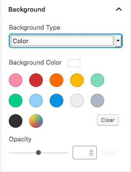
To select a background colour, select
Colorfor Background Type. You can either select the preset colours, or a custom colour by selecting the "rainbow" icon.Helper classes
Included in the theme are also some helper classes that helps with layout. You can add these into the
Advanced > Additional CSS Classessection. To add more than 1, simply separate them with a space between, e.g.-fullbleed -left-fullbleed
This is only to be used when theSectionblock is inside aColumnblock. What it does is it dynamically updates theSectionblock so that it takes up 100% of the width and height of the particularColumn. Notice how the background image spans across the entire column.
-left
In the same example given above, if the "full bleed"Sectionis on the left, you need to include-left, so that the Javascript code knows how to position it properly.-hide-in-mobile-tablet,hide-in-mobile,hide-in-tablet
This tells the theme to hide the section when the visitor is on a mobile device, or tablet device. Similarly,hide-in-mobileandhide-in-tabletdoes exactly what it says.
- Advanced Columns — The
Columnsblock allow you to create multicolumn pages. Anytime you see a page with multicolumns in its layout, it is done using theAdvanced Columnsblock. Once you've added it in, you can adjust the amount of columns you want. Generally, the design can accommodate up to 4 columns easily. It is not recommended to use more than 4 columns as each column would then become too narrow. You can control how it behaves responsively by choosing whether it stacks on mobile / on tablet. -
Headings — The
Headingblock allows you to insert "headers". Headers are text that are bigger and generally in bold.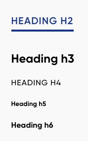
This is how they look like.
H2is used as headings for aSectionblock, whileH4is used as headings inside aColumnblock.H3andh5-6are used more flexibly. - Contact Form 7 Styler — This block allows you to customise the default look of forms created using Contact Form 7. By default, the theme already customises the look of the form to suit the visuals of the website, but you can customise it further if you wish to.
- File — This block allows you to upload a file and creates a button for visitors to download.
- Image — As the name suggests, this block allows you to add an image into the layout.